Work / Coaching platform / 2024–25
Coachinng
The first Arabic AI-powered coaching platform in the MENA region.
Visit coachinng.com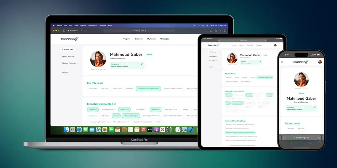
Overview
An AI-powered coaching platform built in Arabic, for Arabic speakers, serving professionals across the MENA region on web and mobile. Personalised recommendations and certified coaching programmes in one place.
Outcome
A usability fix on the booking button took first-try success from 50% to 100%.
- My role
- Lead UI/UX Designer
- Platform
- Web and mobile (iOS, Android)
- Disciplines
- UX research, Usability testing, UI design
The Challenge
Coaching that speaks Arabic.
The market had no Arabic-first coaching platform. Coachinng set out to fill that gap with personalised AI recommendations and certified coaching, on web and mobile.
- Problem 1
- Low user engagement and retention
- Problem 2
- Poor scheduling and communication flow
- Problem 3
- No clear way to measure progress
Goals
- 01
Business
Lead the MENA market with an Arabic-first AI coaching platform, and boost engagement through personalisation.
- 02
User
Coaching in their own language, tailored paths and actionable feedback.
- 03
Design
A smooth cross-platform experience with intuitive navigation and minimal cognitive load.
Understanding the Users
Three people, three different needs.
Coaches lacked tools to manage schedules, stay in touch with clients and track progress. Coachees struggled to find coaches who fit, to trust them, and to stay consistent.
Competitive analysis
CoachHub frustrated coaches with high pricing, little session flexibility and unclear pay, and stayed out of reach for cost-sensitive users.
BetterUp coaches reported low pay, unpaid workload and unreliable support, while coachees faced expensive subscriptions and inconsistent coach matching.
How Coachinng is different
- 01
Personalized for real change
Deeply tailored coaching that goes beyond corporate programmes.
- 02
Whole-person approach
From leadership skills to work-life balance and resilience.
- 03
Your success, your terms
Progress measured by what matters to you, not generic benchmarks.
- 04
Built for everyone
B2B and B2C, for individuals and businesses alike.
Ahmed Al-Shami
The Coach
Wants to
- Help clients reach their goals
- Manage sessions with many clients
- Track client progress easily
Gets stuck on
- Scheduling conflicts
- Fragmented client tools
- Little time to prepare materials
Layla Abdullah
The Coachee, marketing specialist
Wants to
- Advance her career
- Book sessions around a busy schedule
- See clear progress and feedback
Gets stuck on
- Balancing work
- family and coaching
- Complicated training apps
- Unclear how coaching helps
Khaled Mansour
The HR Manager
Wants to
- Make development programmes succeed
- Measure coaching ROI
- Get clear reports
Gets stuck on
- Inaccurate participation data
- Integrating with existing systems
- Reporting to many stakeholders
Mapping the Experience
Mapping every role, step by step.
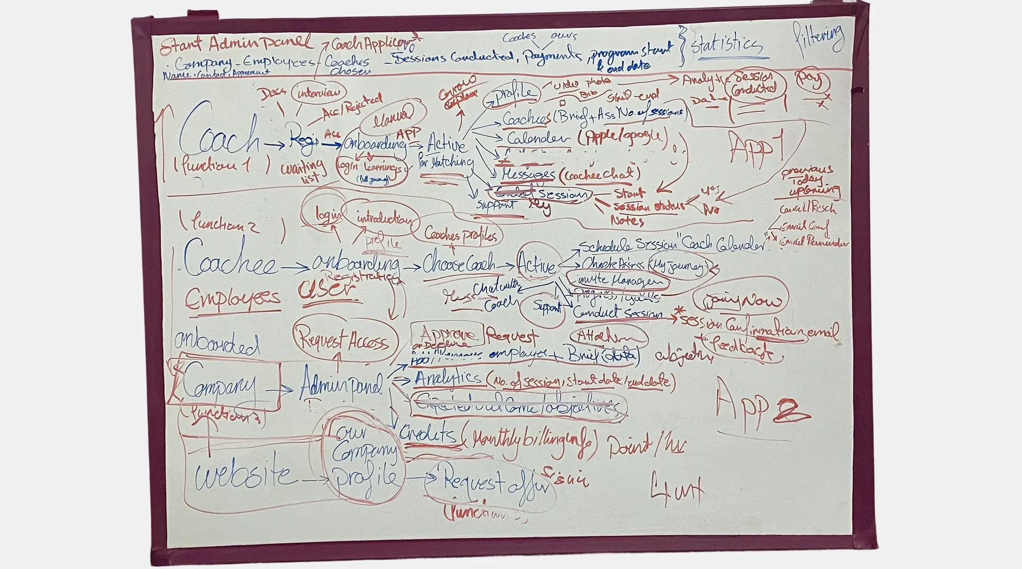
I mapped the platform for its three users (coach, coachee and company) on a whiteboard first, then turned the key journeys into clear flows.
Coach flow
Register
Apply
Waitlist
Book demo
Data reviewed against requirements
Join platform
Once accepted
Coachee flow
Sign up
Onboarding
Choose coach
Join platform
Exploring Solutions
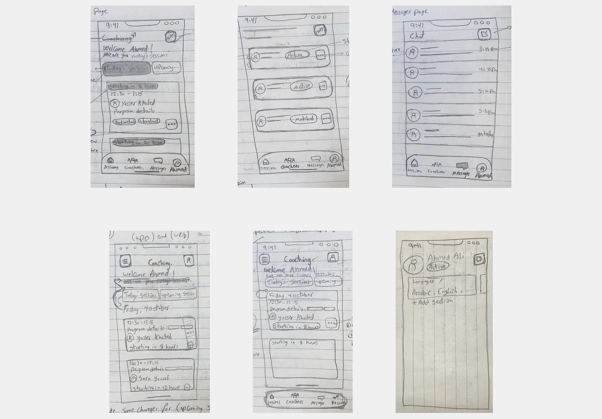
From paper to screens.
Early ideas for the mobile app started as paper wireframes, later refined into the final design.
Designing the Interface
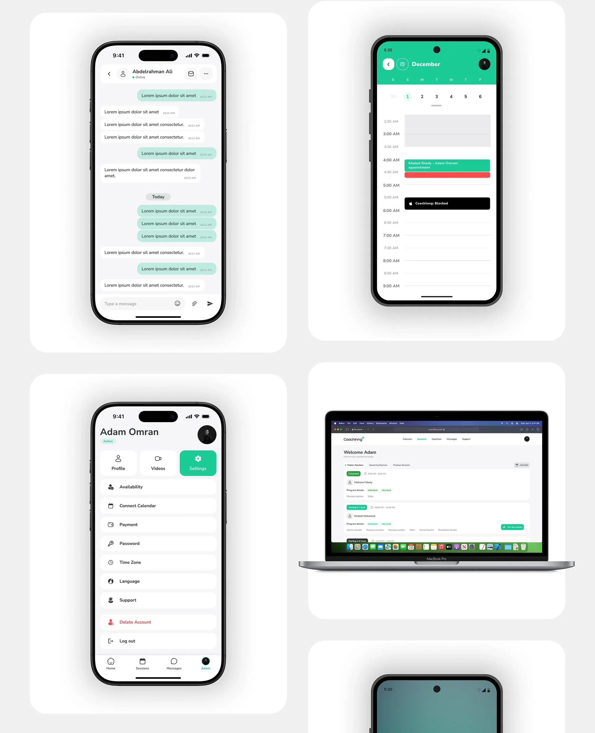
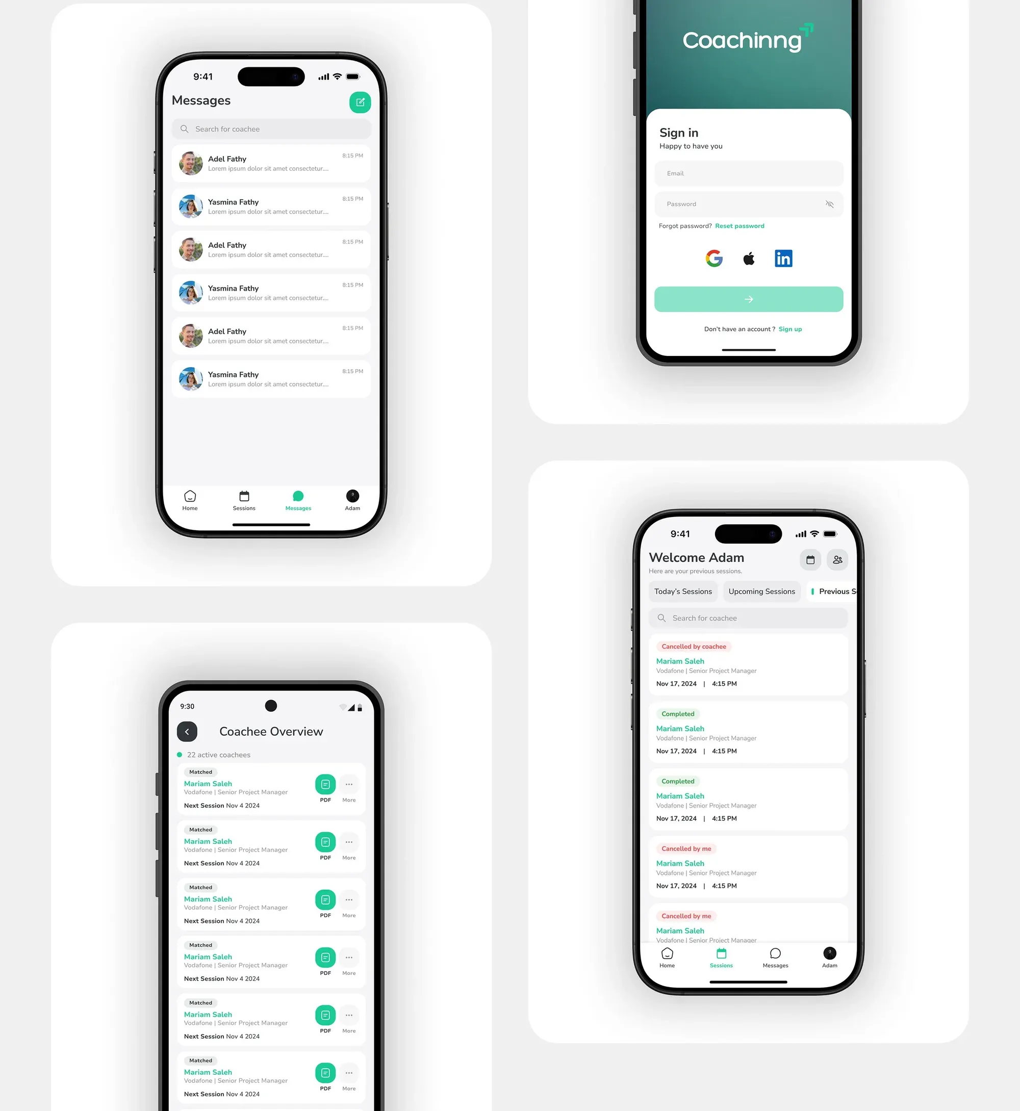
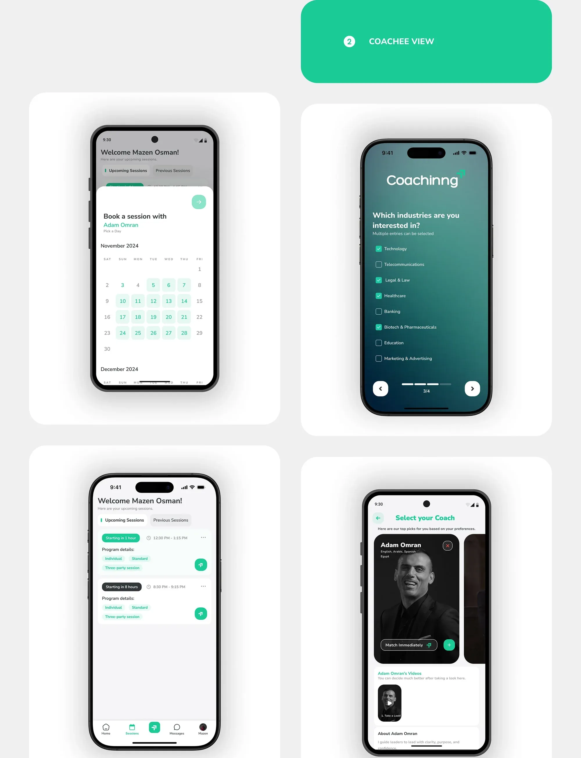
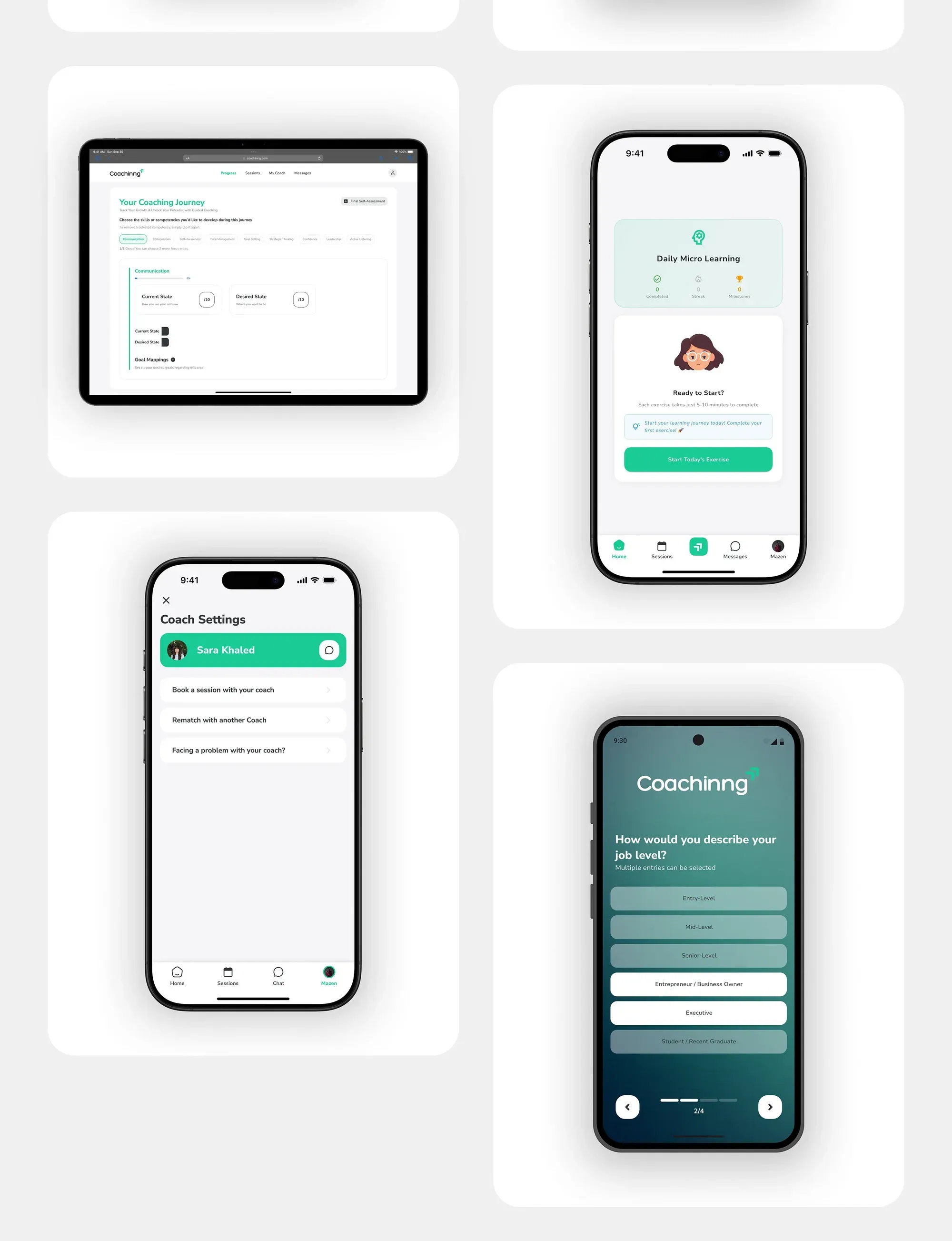
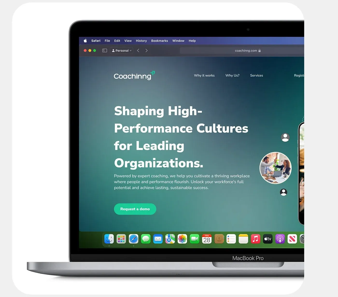
Two apps, one platform.
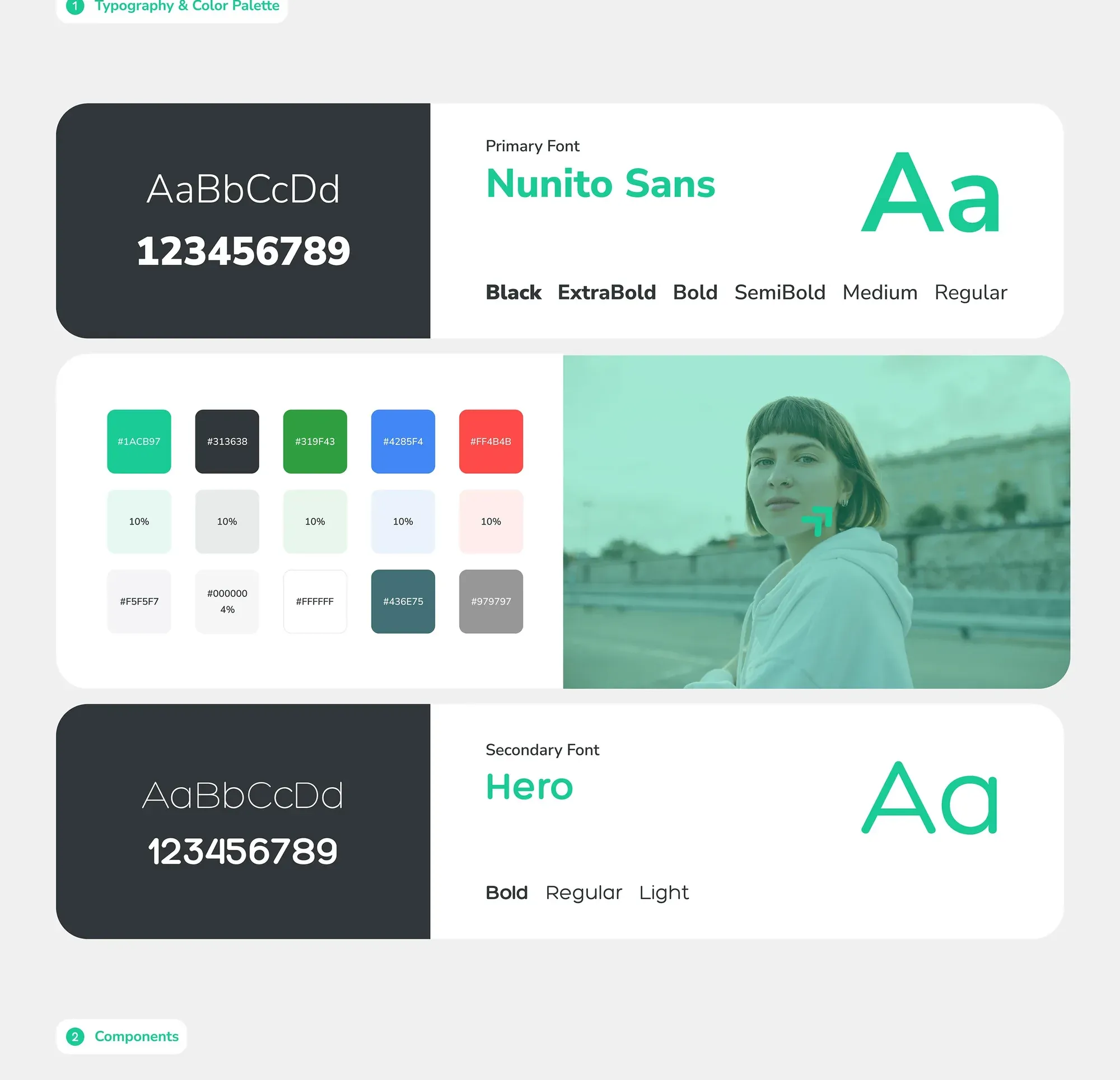
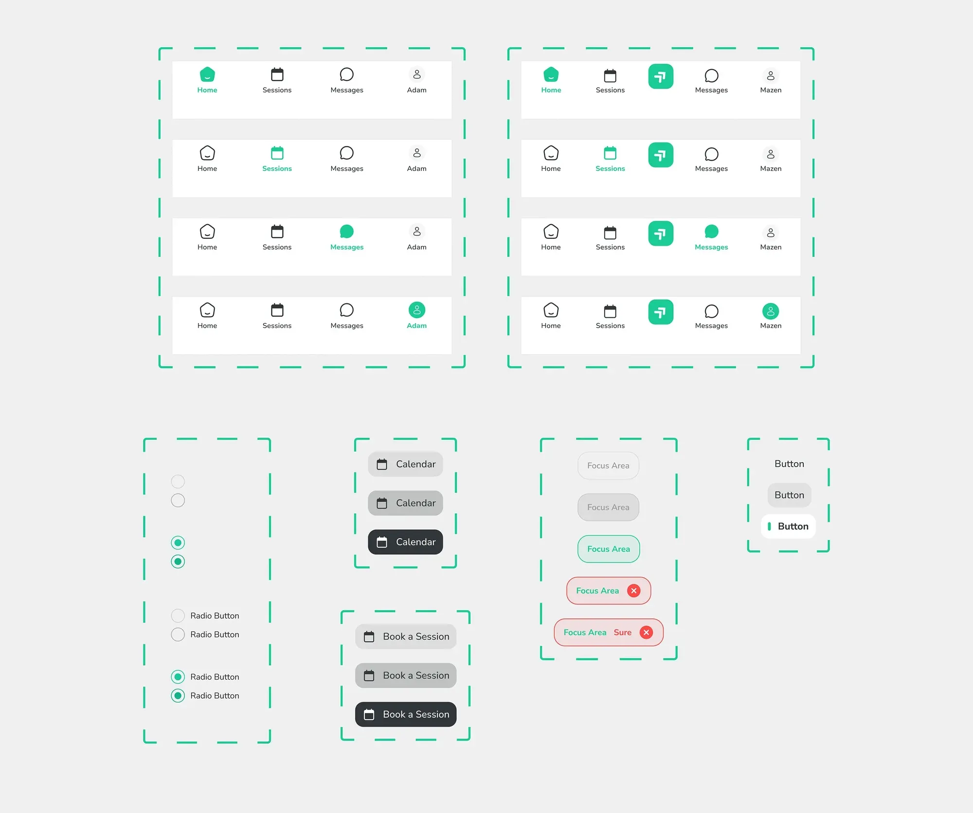
I refined layout, typography and colour for consistency and clarity. Usability feedback guided small tweaks and micro-interactions.
Testing, Iteration & Delivery
People couldn’t find “Book a Session”.
A moderated usability test with 6 participants showed a recurring problem. Users struggled to find the most important button in the app.
What we found
- 01
Hidden in a corner
The button sat in a less noticeable area and needed extra navigation steps.
- 02
Wrong place to look
Users looked in the navbar first, but the action was at the top right.
- 03
50% success
Only half of users found it on the first try.
- 04
28 seconds
Average time to find it. The target was under 10 seconds.
“I expected to see the booking button right in the main menu.”
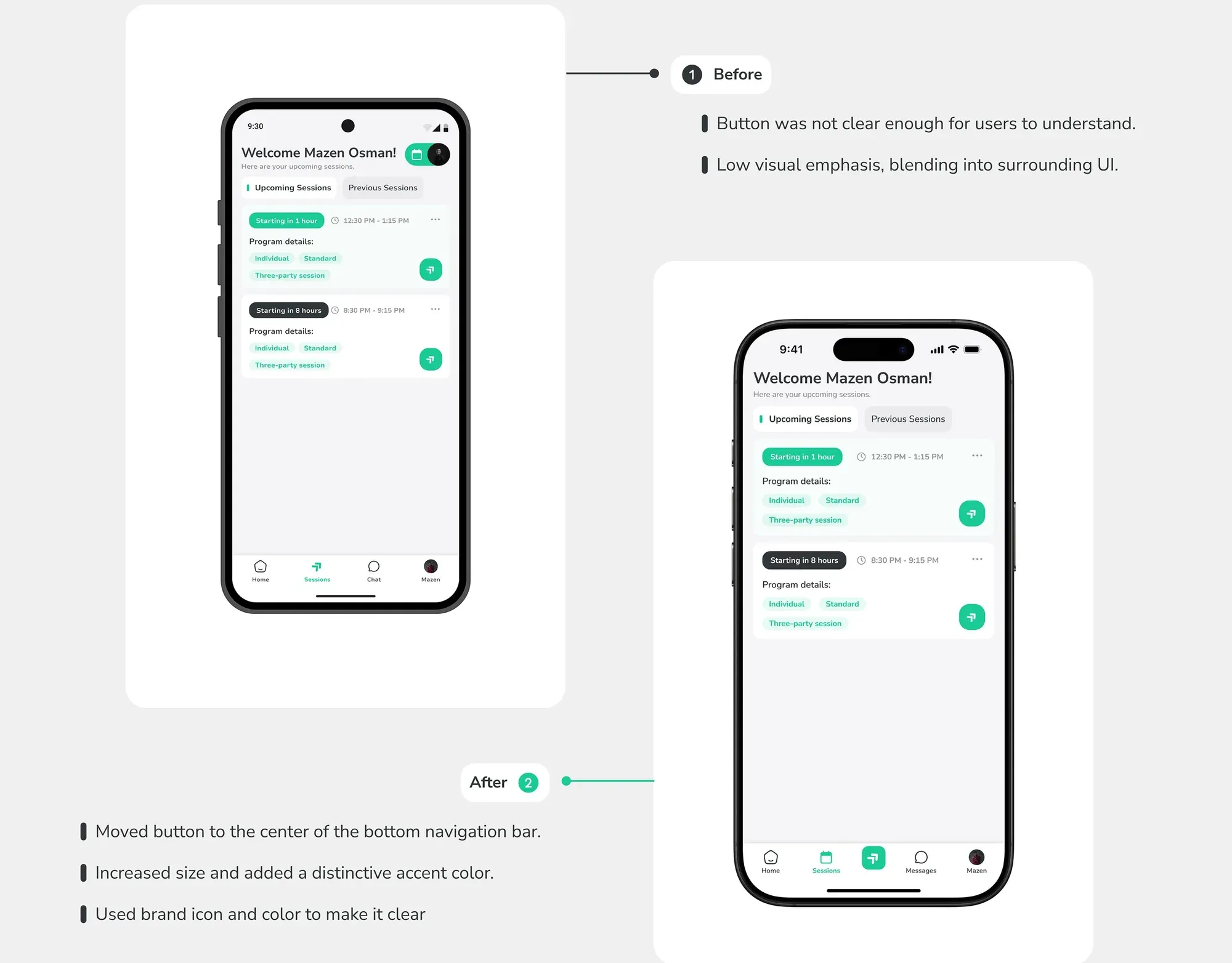
- 100%
- First-try success, up from 50% (retest with 5 new participants)
- 6s
- Average time to find the button, down from 28s
- 5/5
- Participants called it “very easy to find”
Outcomes & Reflection
A brand that feels its own.
The colour palette and typography were chosen to spark the right emotions, stay accessible and stay consistent across every touchpoint.