Overview
A mobile app that lets people request a qualified nurse or caregiver to their home, follow the care, and share the patient’s medical history, all from their phone.
- My role
- UI/UX Designer
- Timeline
- Jun – Aug 2023
- Platform
- Mobile app
- Disciplines
- Design strategy, Wireframes, Prototyping, Visual design
- Tools
- Figma, Adobe Photoshop
The Challenge
Caring from a distance is hard.
Most people can’t always be with the people they care for. They don’t have time to find a reliable caregiver, follow the progress, share the medical history and track medicine all at once.
The solution
An app to choose and request the right caregiver to look after someone at home, make sure they are reliable and trusted, and give them the patient’s full medical history.
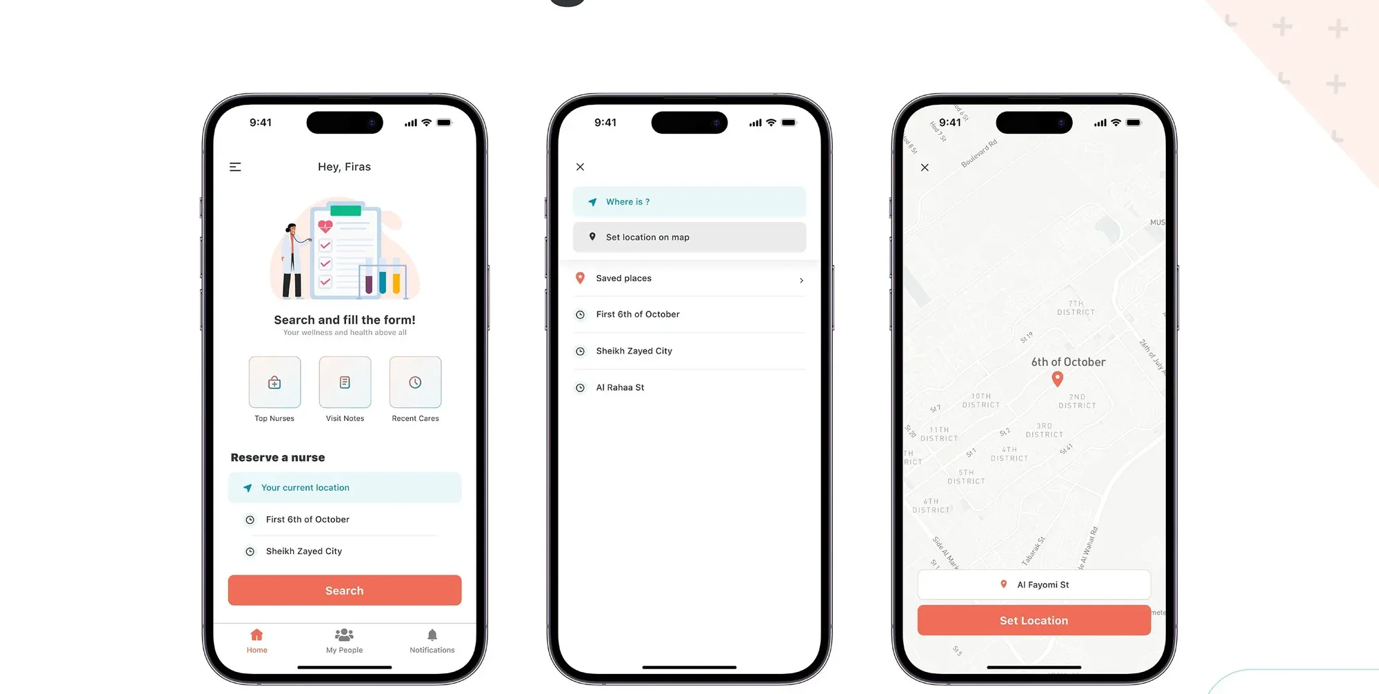
Users enter their location and schedule, and the app matches them with available nurses nearby.
Design process
Empathize
User research and interviews
Define
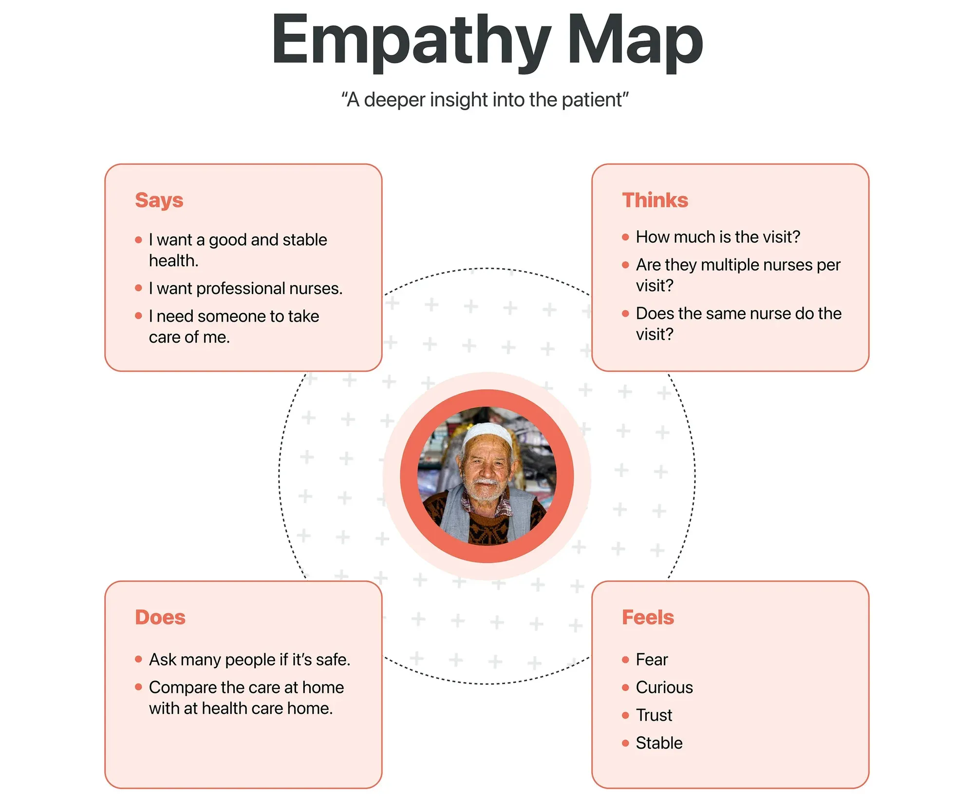
Pain points, personas, empathy map
Ideate
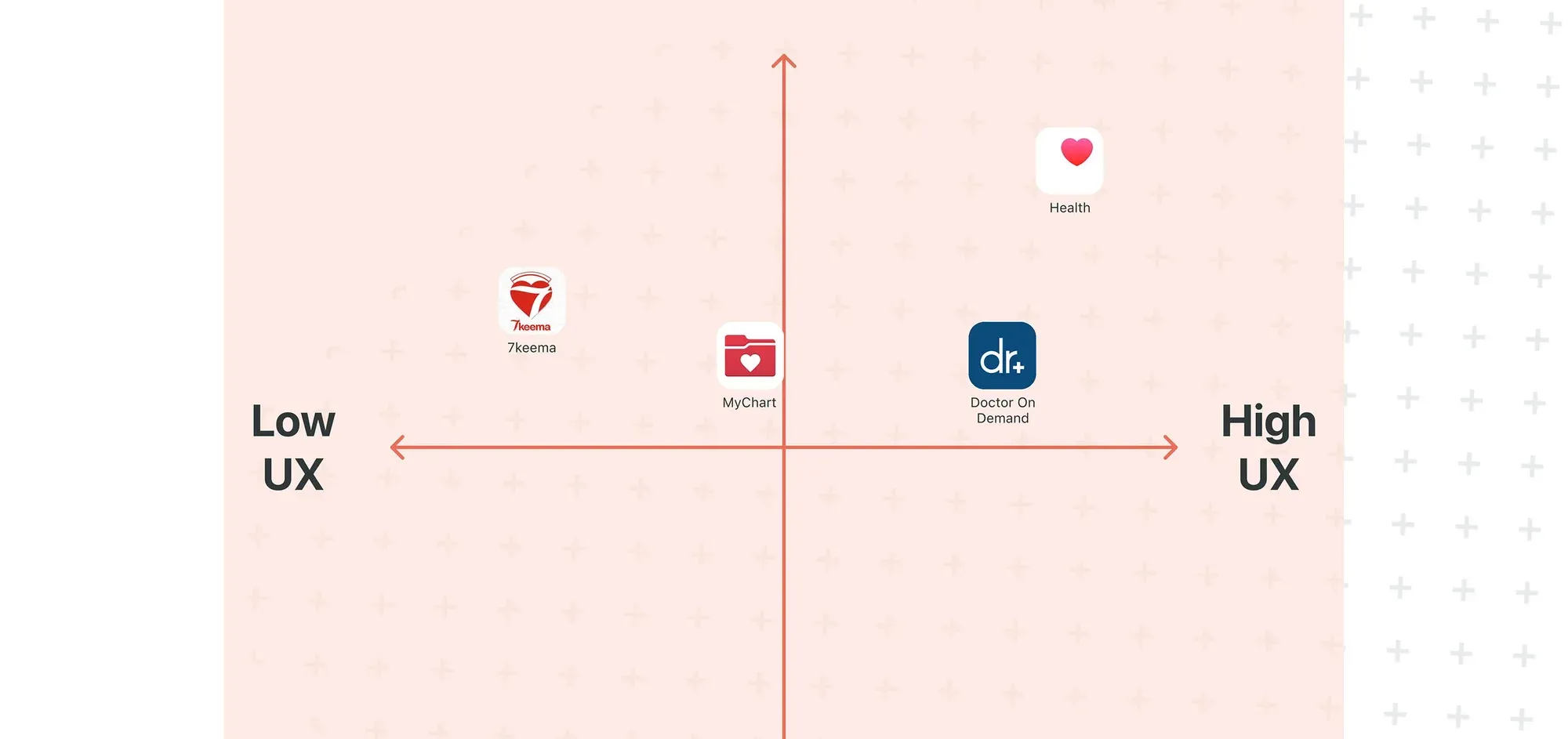
Competitive analysis, user flow
Prototype
Wireframes and visual design
Test
Usability testing and improvements
Understanding the Users
The nurse, the patient and the relative.
Surveys, interviews, competitive analysis and usability testing showed one main pain point. Finding qualified home healthcare took too long and felt uncertain.
Karmen Saleh
The Nurse, 29
Wants to
- Care for many people each day
- Be known as a top nurse
Gets stuck on
- No proper follow-up
- Hard to give care in a reassuring way
Abdelsalam Osama
The Patient, 76
Wants to
- Stay healthy enough for daily tasks at home
Gets stuck on
- Care homes feel far from home and unsettling
Firas Abdelsalam
A Relative, 27
Wants to
- Grow his career while caring for his father
- Know his father is in safe hands
Gets stuck on
- Leaving his father with strangers
- Not getting enough care
Mapping the Experience
From the home screen to a booked nurse.
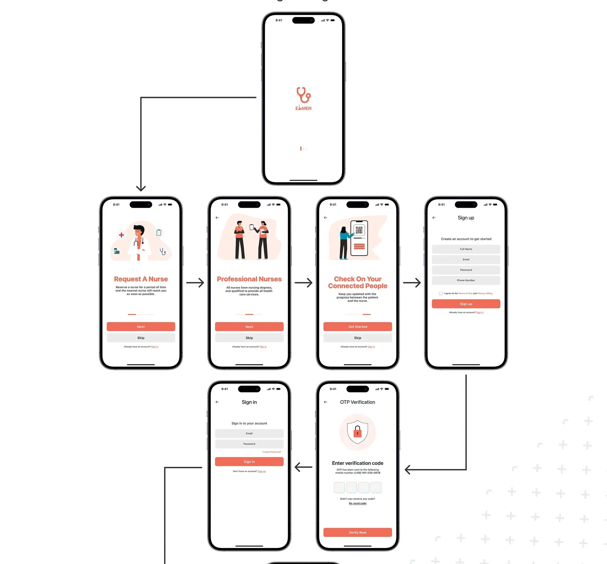
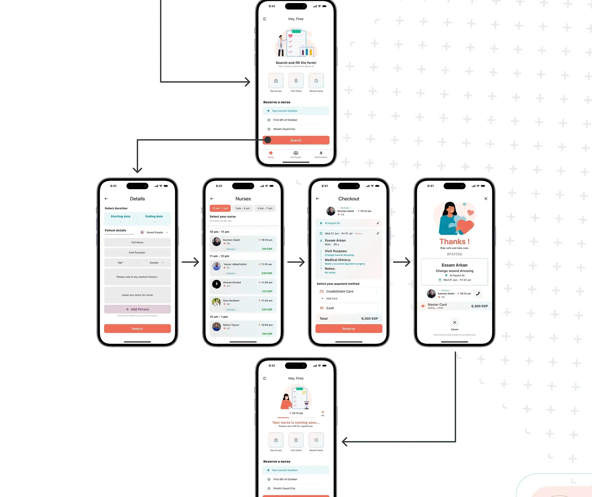
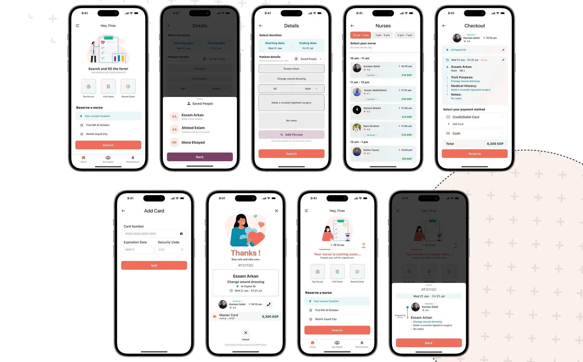
I structured the whole app first, then mapped the path a user takes to reserve a nurse.
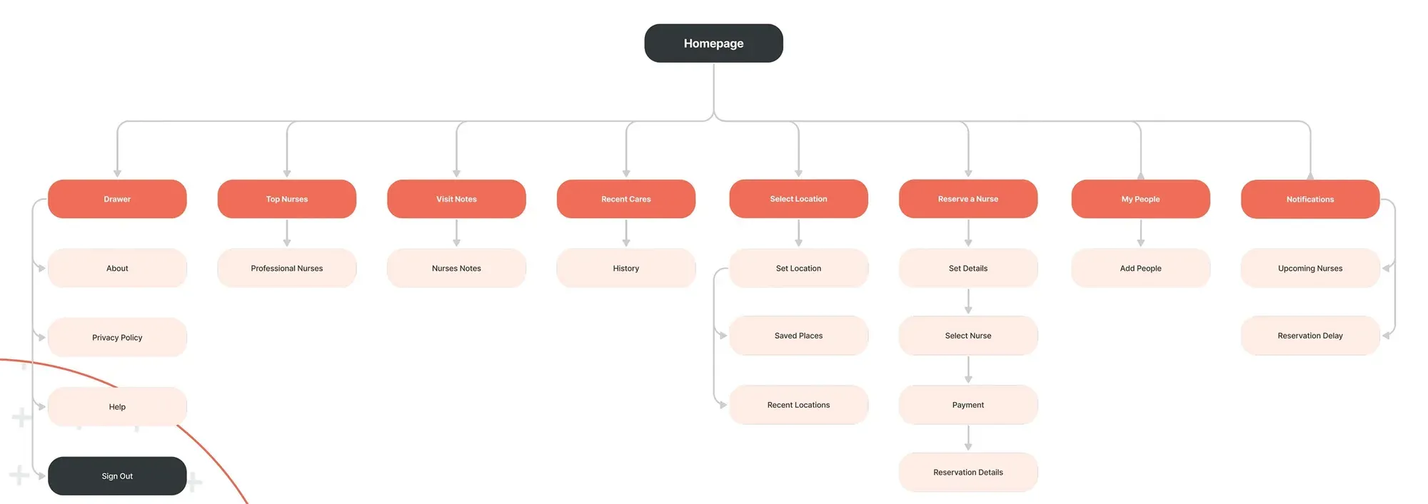
Reserving a nurse
Home
Set details
Dates, patient, medical history
Select nurse
By time, rating and price
Payment
Reservation details
Exploring Solutions
Features that set it apart.
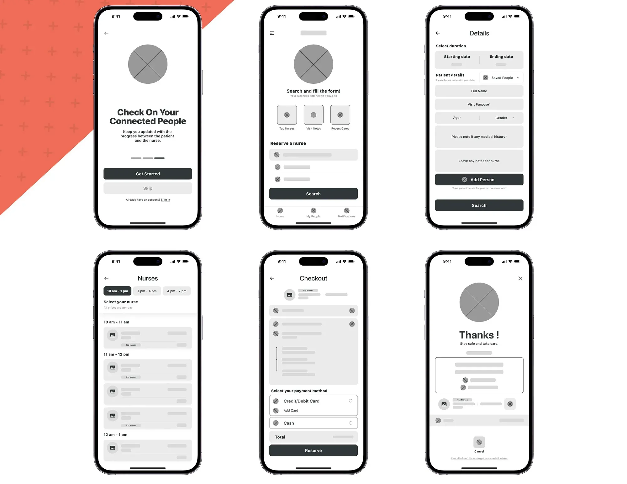
After analysing competitors, I picked features that give users an advantage, then sketched them as low-fidelity wireframes.
- 01
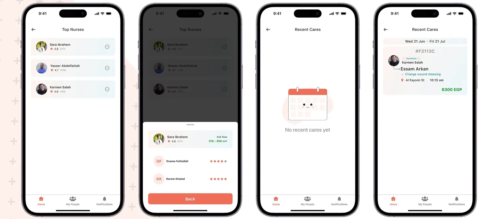
Top Nurses
Ratings and prices to help users choose the right nurse.
- 02
Visit Notes
Notes after every visit, so family can follow the care.
- 03
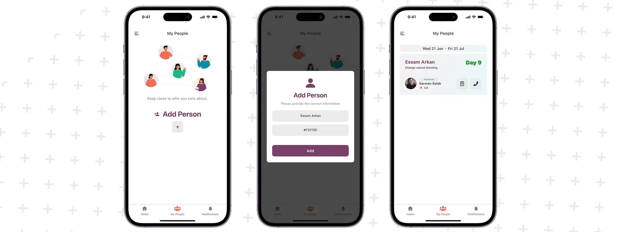
My People
Connect the people you care for and track their healing.
- 04
Recent Cares
Every past care in one place, with nurses and costs.
Designing the Interface
Calm, warm and easy to trust.
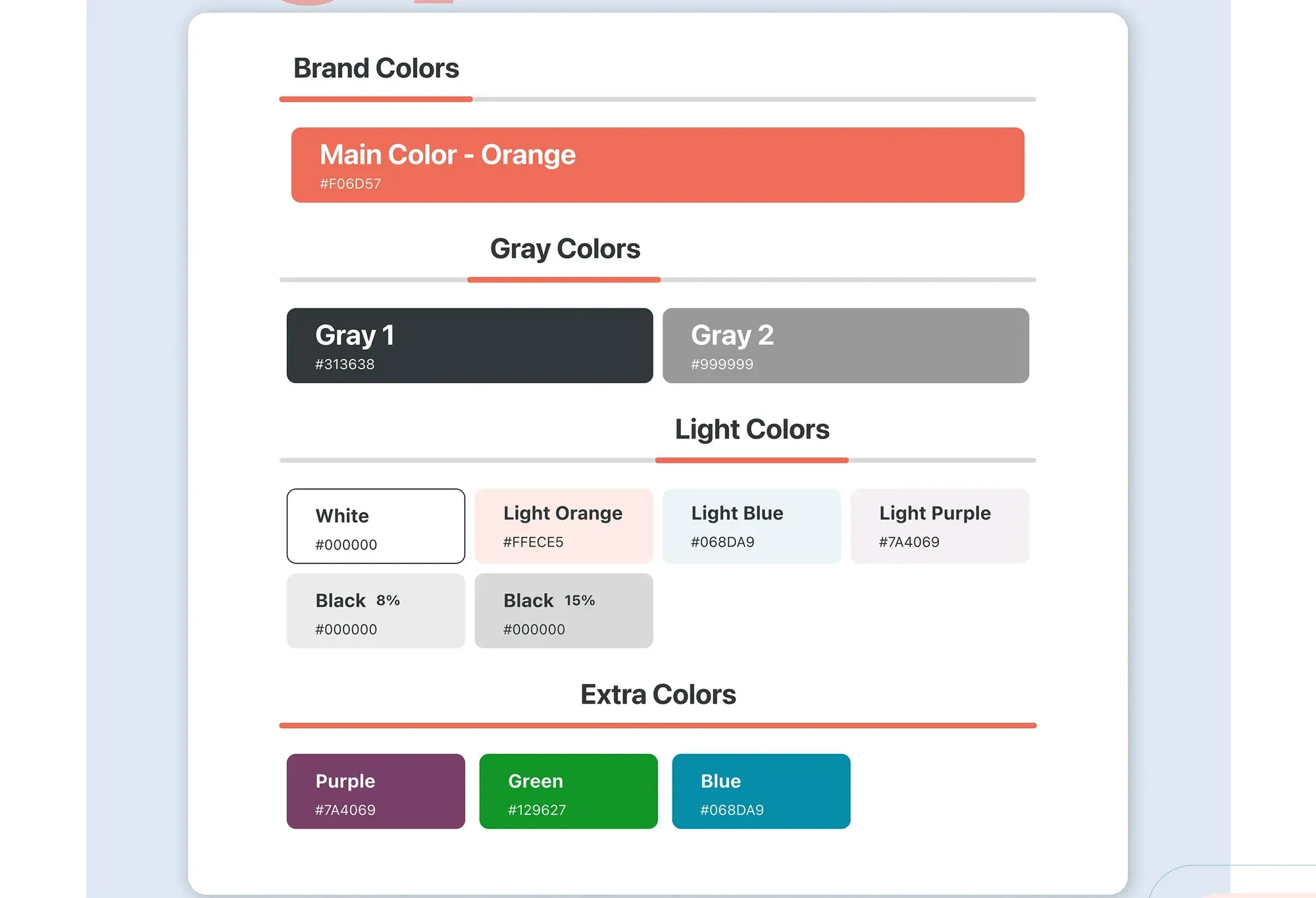
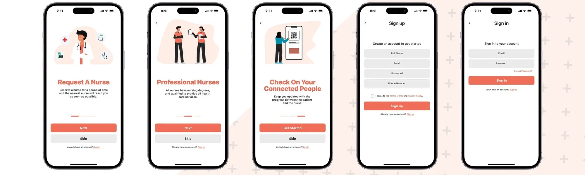
An orange brand colour, friendly illustrations and clear screens for every step of the care.
Outcomes & Reflection
A style guide to grow with.
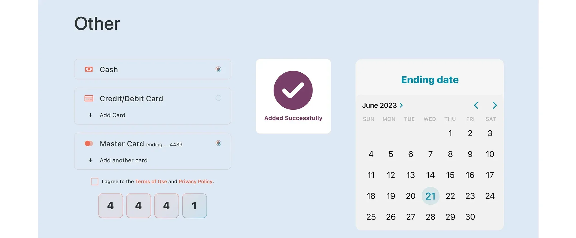
Colours, typography (SF Pro) and reusable components keep every screen consistent.