Overview
A redesign of FASTIN, an employee check-in app, to improve its UX, visuals and performance. Research-led changes made it clearer, faster and easier to use, in light and dark mode.
Outcome
User rating, task completion and conversion all improved after the redesign.
- My role
- UI/UX Designer
- Team
- With Ahmed Tarek (UI/UX Designer)
- Platform
- Mobile app (English and Arabic)
- Disciplines
- UX research, Usability testing, UI redesign
- Tools
- Figma, Maze, Notion, Adobe Photoshop
The Challenge
Poor navigation, outdated visuals.
Users were frustrated by confusing navigation, an outdated look and inconsistent flows. Fixing them would boost satisfaction, speed up daily tasks and keep users coming back.
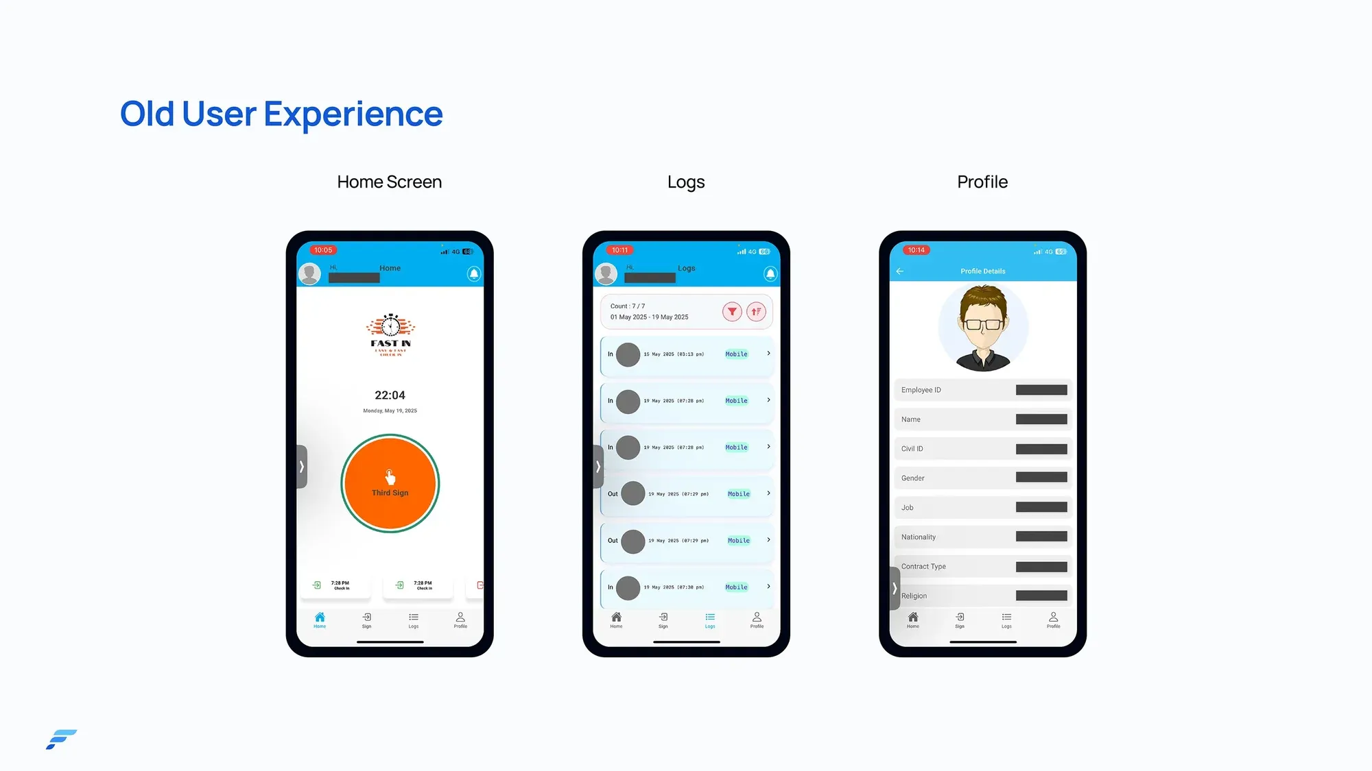
Understanding the Users
Listening before redesigning.
We combined three research methods to understand how people really used the app.
- 01
User interviews
Understand behaviours, motivations and pain points in depth.
- 02
Usability testing
Find usability issues, navigation barriers and confusing elements.
- 03
Surveys
Collect data on satisfaction, preferences and needs.
Mapping the Experience
Ten features, rethought.
Research pointed us to the parts of the app that needed the most work.
- Entry
- Splash screen, login
- Daily use
- Check in and out, face detection
- Tracking
- History view, filter, notifications
- Account
- Profile, settings, dark mode
Exploring Solutions
What changed, and why.
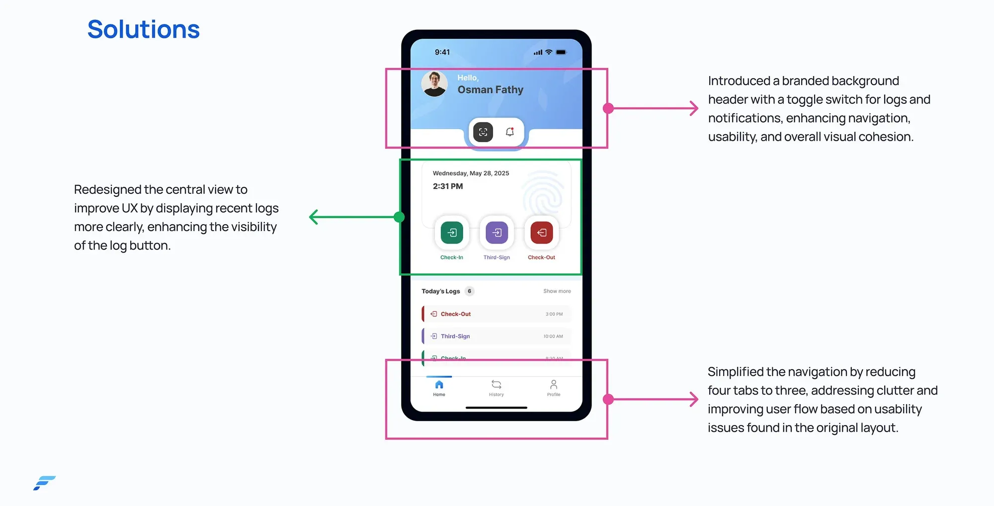
Three decisions shaped the new home screen.
- Decision 01
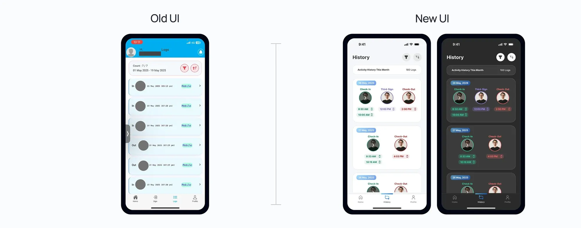
Four tabs became three
Why
The old navigation was cluttered and caused usability issues.
- Decision 02
Recent logs moved to the centre
Why
People could see their activity clearly, and the check-in buttons stood out.
- Decision 03
A branded header with quick toggles
Why
One tap to switch between logs and notifications, with a more cohesive look.
Designing the Interface
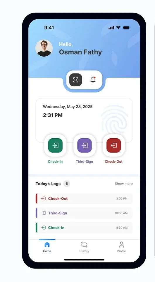
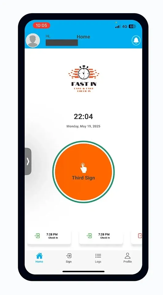
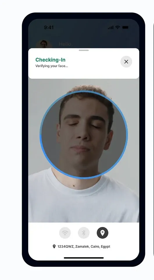
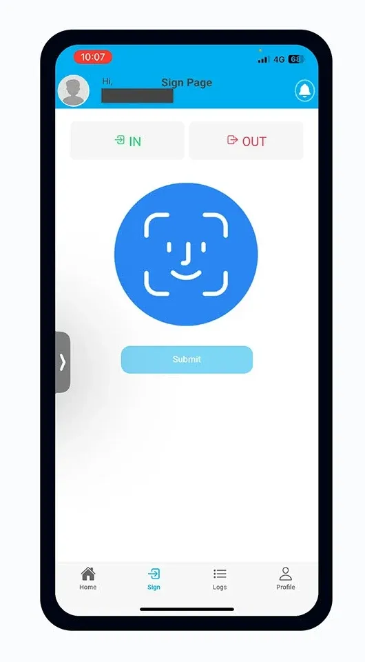
Old UI, new UI.
Drag to compare the old and new screens.
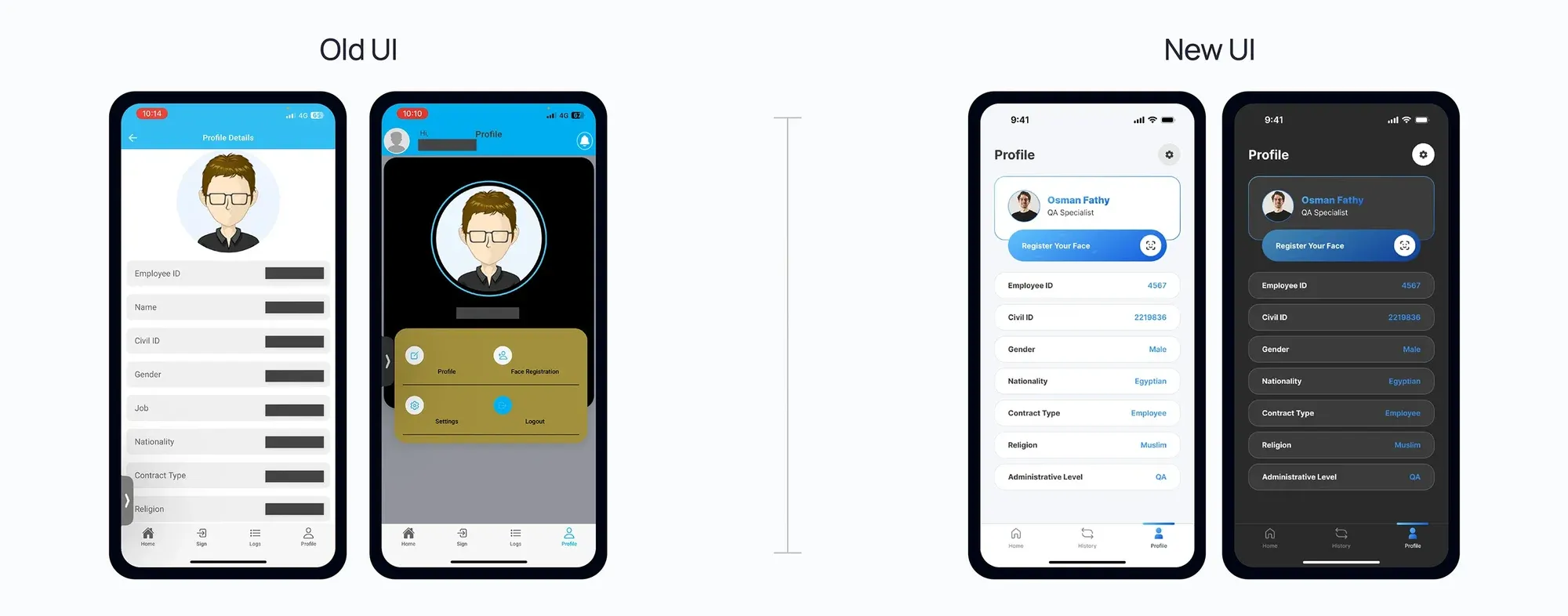
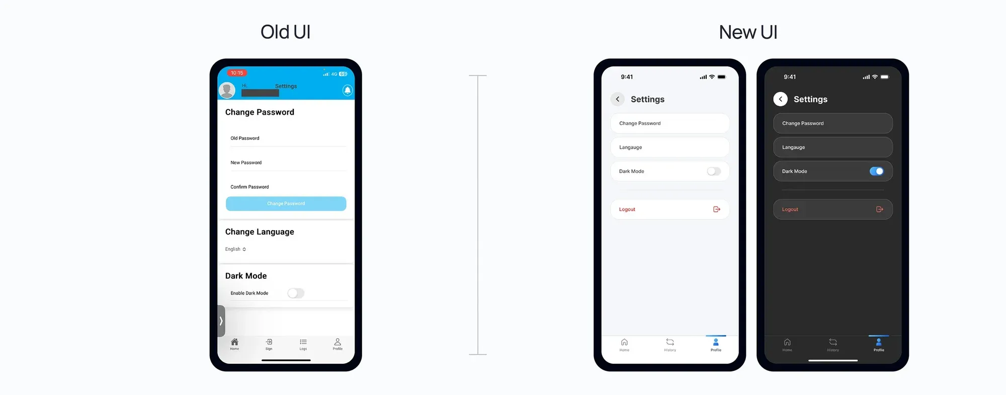
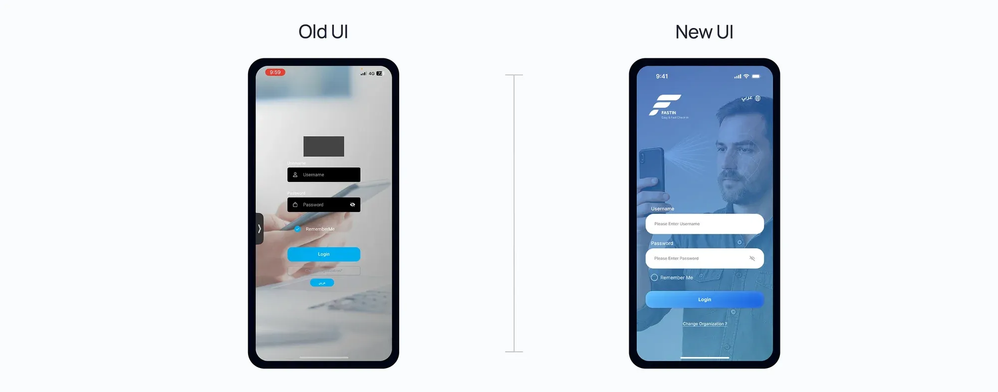
Outcomes & Reflection
Better on every measure.
We compared the app’s key metrics before and after the redesign, on a 0–5 scale.
- 4.6
- User rating, up from about 2.2
- 4.4
- Conversion rate, up from about 2.0
- 4.4
- Task completion, up from about 3.5